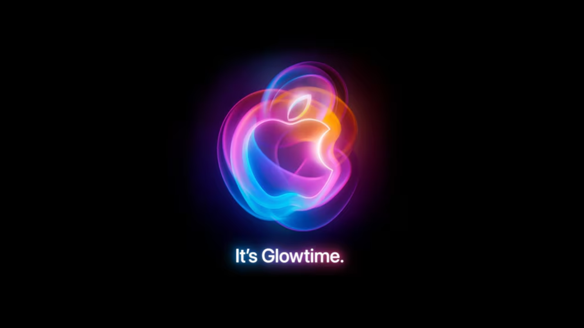
I just watched Apple’s new presentation titled “It’s glowtime” during which the new iPhone model, this time numbered 16, was showcased. Can we draw conclusions about current trends in the world of presentations based on this event?
Of course, there weren’t any narrative fireworks like during Steve Jobs’ time. And, of course, there was no technological revolution either. In fact, there wasn’t even an audience, making the whole thing feel more like a beautifully directed film, rather than a presentation.
A friend of mine, who does a lot of presentations, even remarked, “this was the most soulless of all Apple presentations.” Unfortunately, there’s some truth to that. The presentation was meticulously planned, done very correctly, following all the rules of cinematic, narrative, and marketing art. But back when Jobs was in charge, those presentations were a feast for storytelling enthusiasts – there was always something that surprised you. And here… Presentations by tech giants are starting to resemble commercials for headache pills. All cut from the same mold.
But you have to hand it to Apple: their design is a masterpiece. Product design, space design, information design. What I liked the most, however, was the stage design around the presenters. It was excellently crafted. In every detail. The colors, the spaces, the details.
The author of the stage design: nature. Creative collaboration: talented architects. Thank goodness the hype around the metaverse has passed.
If you want to watch the full presentation, you can click below:
And if you’d like to start creating presentations like Steve Jobs, ask me about training in presentations, storytelling, or public speaking.

